Hello Everyone,
Over the years, I have had many questions on how I choose color for my quilts, and more so once I have chosen color how do I choose the fabric? Another BIG question is how do you use those wonderful prints, I just don't know how to use them or cut them up?
Sometimes there is no easy answer or they may be multiple answers. I am going to do my best to give you some answers, at least as I see them.
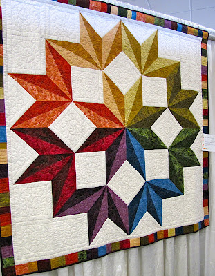
To many of my readers the above block may look familiar. I just profiled it this week in my
blog post here. This block is from a quilt that I made for
Quilt Magazine called
Soul Flower. I wanted to show you a completely different color option, so I made the block above with colors that are vibrant and non expectant.
The above photo show the quilt from the magazine and as you can see the block looks totally different, right? So this is that example of using those wonderful prints and cutting them up to use in a block. The prints in the first photo are mostly larger scale prints than in the second photo.
Here is my rule of thumb for larger scale prints. I like to look at it as one color. Choose the dominant color and see it as that. The print is the texture. Are you following? If you do this, you have a whole new outlook on how to use those prints. I made the block in the first photo saying to myself that I wanted a hot pink and green block with some accent colors of purple and yellow. Then I went to my stash and started pulling fabric with colors that worked together.
I think it was successful. Now in the second photo the colors also work together because there are common colors in each fabric so they draw from one another giving it a cohesive look. That is what makes this work.
Also, in a recent
blog post, I featured my quilt
Paradise Island. In that post, I showed you two color options. But the good folks over at
Quilt Magazine have been kind enough to provide a FREE download for you. It is a line drawing of my design so that you can take out those colored pencils and make you own color way!!
You can see above that I did the download and started coloring in the lines. This is a great way to choose color for your quilt. It doesn't involve cutting into any fabric and gives you a relatively quick way to see what it might look like.
If you don't have a line drawing of your quilt, easy, get some graph paper and start to doodle, draft your quilt make copies of your line drawing and then color each one in different color ways!

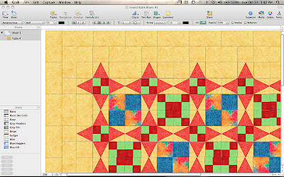
For those of you who use computers to design your quilts, there are specific programs out there like EQ. But for those of you who don't have it here is another option. I have a Mac and use their Numbers program to design all my quilts. Numbers is the equivalent to Microsoft Excel.
It is a great way to use the actual fabrics! Yes, you can use the images of the fabrics that you want to use in the quilt by either scanning or using the jpegs from the websites.
In the photos above and below you can see how I came up with the two different color ways for
Paradise Island.
Using this program might be a great lesson for anyone wanting to learn. If you have a Mac and are interested in learning let me know. If I have enough interested, I just might consider doing several tutorial posts.
Above is another example of coloring in a design to see what it might look like. I had posted about this one
here.
These are the fabrics that I chose for the quilt pattern.
Here you can see the cover sheet quilt and it's colors next to my line drawing and fabrics.
You can order the pattern by
clicking here.
Her is the finished quilt. As you know, I named it "I Am Not Afraid Of Color".
I hope after reading this post you are now not afraid of color and start to play with it yourselves. I know that this will be a great exercise for you, but give it a try. Be fearless and go with your instincts. I know this will open up more discussion and that is terrific!
Don't forget 5 more days until block number 2 for the
Blogger's Block of Month is released! Don't forget to come back here for the link, I know you will love this one, it is beautiful!!
Until Next Time...


Choosing Color... A Guide


